只利用CSS创建收缩导航栏
前言
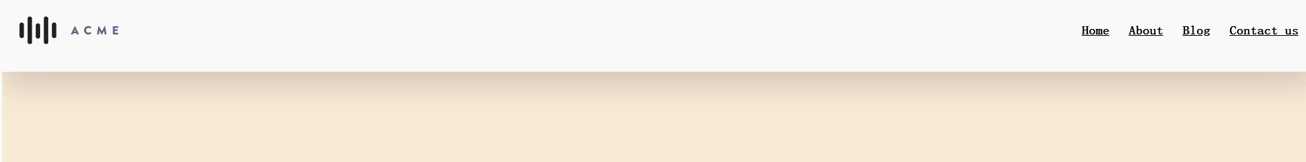
想象一个漂亮而厚实的网站标题,在内容的顶部和底部有大量填充。当你向下滚动时,它会自行收缩,减少一些填充,为其他内容腾出更多的屏幕空间。
如下图效果:
这时有经验的人就会立刻想到使用JavaScript来向获取滚轮,再动态监听元素,添加Class来实现这样的效果。
然而其实这样的效果只需要灵活利用position中的sticky粘性属性即可实现,不需要JS内容。
实现,说明一下,我通常不喜欢粘性标题。我认为他们占用了太多的屏幕空间。然而,您是否应该在自己的网站上使用粘性标题是一个问题。这实际上取决于您的内容以及始终存在的导航是否为其增加了价值。因为在使用粘性标题后就会带来一系列的问题,比如内容溢出覆盖等等。
教程
首先,我们导航栏结构需要如下:
<header class="header-outer">
  <div class="header-inner">
    <div class="header-logo">...</div>
    <nav class="header-navigation">...</nav>
  </div>
</header>
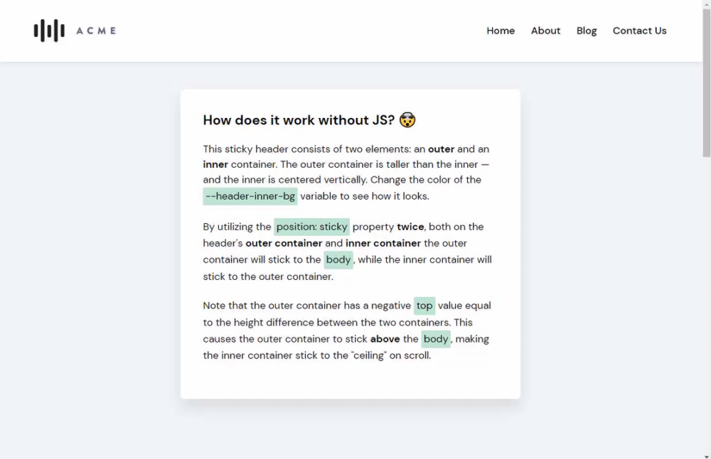
其中 header-outer只有一个功能那就是 让在顶部时将其 header变得更高。而header-inner这是真正的导航栏内容容器。
定义它们的样式:
      .header-outer {
        height: 120px;
        width: 100%;

        display: flex;
        align-items: center;

        position: sticky;
        top: -50px;
        background-color: white;
        /* 增加底部阴影,让其更有质感 */
        box-shadow: 1px 19px 50px rgba(0, 0, 0, 0.17);
      }
      .header-inner {
        height: 70px;
        width: 100%;
        position: sticky;
        top: 0;
        margin: 0 25px;

        display: flex;
        align-items: center;
        justify-content: space-between;
      }
这里两个内外header都设置为sticky属性。
其中内部header的top为0,是为了确保容器在变得粘稠时将自身显示在最顶部。
这时需要注意的诀窍来了,为了让内部容器真正贴在页面的“天花板”上,需要给外部header的top设置一个负值,其值为 两个容器之间的高度差,使其贴在更“上方”。这里内部header高度为70px,外部header为120px,所以这里外部header的top值为70px-120px= -50px。
这边就轻松实现了收缩导航栏效果了。
最后我们可以加入亿点其它内容,大概如下。
<style>
body {
margin: 0;
min-height: 200vh;
background-color: antiquewhite;
}
.header-outer {
height: 120px;
width: 100%;
display: flex;
align-items: center;
position: sticky;
top: -50px;
background-color: white;
box-shadow: 1px 19px 50px rgba(0, 0, 0, 0.17);
}
.header-inner {
height: 70px;
width: 100%;
position: sticky;
top: 0;
margin: 0 25px;
display: flex;
align-items: center;
justify-content: space-between;
}
.header-logo img {
display: block;
height: 40px;
}
.header-navigation {
display: flex;
flex-wrap: wrap;
}
.header-navigation a {
font-size: 1.125rem;
color: inherit;
margin-left: 1.75rem;
position: relative;
font-weight: bold;
display: inline-block;
}
.header-navigation a:hover:after {
transform: scalex(1);
}
.header-navigation a:after {
transition: 0.25s ease;
content: "";
display: block;
width: 100%;
height: 2px;
background-color: currentcolor;
transform: scalex(0);
position: absolute;
bottom: -3px;
left: 0;
}
</style>
<body>
<header class="header-outer">
<div class="header-inner">
<div class="header-logo">
<img src="https://assets.codepen.io/285131/acme-2.svg" />
</div>
<nav class="header-navigation">
<a href="#">Home</a>
<a href="#">About</a>
<a href="#">Blog</a>
<a href="#">Contact us</a>
</nav>
</div>
</header>
</body>
轻松实现: